7 Reasons You Need to Be Using Landing Pages
You’ve come across them everywhere: Landing pages that take you to a website but aren’t the homepage.
It’s a great strategy that helps get visitors directly to the information they want to see from a marketing source – social media, advertising, etc. – and is generally designed for a specific goal.
If using landing pages isn’t already part of your website strategy, it’s time to consider them. Here, we’ll look at seven reasons you need to be using landing pages to help drive the right kind of conversions on your website.
1.) Drive Conversions by Sending Visitors to the Right Place
Landing pages provide a level of specificity that helps people find what they are looking for. A good landing page has one specific thing for visitors to do – fill out a form, buy an item, watch a video, etc.
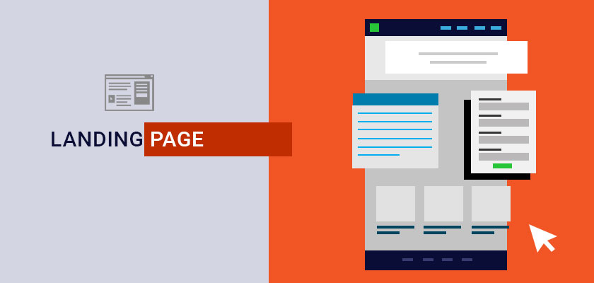
These pages are often shorter than many of the other pages on your website with a main image and text block, actionable elements, and supporting evidence. The page fits in the “shell” of your website, often with the same head and footer as other pages so that it looks consistent for users.
For the best chance at driving conversions, create super-specific messaging here that directly relates to the call to action. Don’t make users look too hard for information.
If the ad or social media post that leads users to the landing page highlights the purple widget your company sells, the landing page should be all about the purple widget, not a collection of everything you do. (That’s what the homepage is for.)
The key element of this landing page is it helps visitors get to the right place. Almost half of all materials link to a website homepage. (Think of how much digging you might have to do to find the exact thing that made you click a link.)
2.) Collect Actionable Information
In addition to conversions, a landing page can help you collect usable and actionable data about website visitors. (Just make sure you have an analytics tracking tool assigned to the page.)
This data includes:
- Demographic information
- Referral sources
- Interest in offers
- Conversion rates (interest)
- Conversion information
You can use all of this information to help generate better future campaigns and make business decisions.
3.) Design Pages for Action

Landing pages are designed for action, making them an ideal location for forms of quick sales.
The other key benefit is that if you have some data about your best audience segments or customers, you can design hyper-targeted campaigns that speak to these people specifically. This can greatly increase the overall number of conversions, as the “right people” visit the landing page.
Design the page with imagery, language, and an offer that speaks exactly to that target audience.
If you have multiple and varying audiences for the same product or service, create multiple landing pages with imagery and language or an offer that speaks to each one.
For example, if you own a gym, you may show images of women working out on one landing page and men on another. The ending offer to sign up may be the same.
4.) They Feel Personalized
- Consider different button colors or a color palette that appeals to the audience
- Keep forms short and ask for as little information as possible
- Use a voice that speaks to this audience (even if it is a little different than other pages)
- Add a video or photos that connect directly with the user segment
Article written by DesignShack.net.
